Brand kit
The Digital Persona brand, in one place.
Logos, colours, type and icons for press, partners and anyone writing about Digital Persona. Use them as provided; if you need something that isn't here, ask us first.
Logo
A lowercase p, present.
The mark is a geometric p, for persona, on a rounded tile. The green light is the presence dot on a profile picture: your voice, online and showing up, even when you're busy.
Mark
Primary. Use on light backgrounds.
Mark, reversed
For dark backgrounds and dark mode.

Logo
Mark and wordmark together. The default lockup.

Logo, reversed
The lockup for dark backgrounds.
Clear space
Keep a margin of at least a quarter of the mark's width on every side.
Minimum size
The mark holds up to 16 px. Show the full logo at 96 px wide or more.
Colour
Warm paper, deep ink.
A quiet, editorial palette. The accent is used for emphasis, never as a background, and never as a gradient in the interface.
- #0B1220
Ink
--ink
Text, the mark's tile, primary buttons.
- #F7F6F1
Paper
--canvas (light)
The page. Warm, never pure white.
- #EFEDE6
Paper deep
--paper-deep
Sections and cards that need separation.
- #0A66C2
Accent
--accent (light)
Links and emphasis. Sparingly.
- #4BA3FF
Accent bright
--accent (dark)
The accent on dark grounds.
- #34D399
Signal
--success (dark)
The presence light. Success states.
- #07090F
Night
--canvas (dark)
The page in dark mode.
Typography
A serif for voice, a sans for work.
Three families, all free from Google Fonts. The contrast between the editorial serif and the precise sans is the brand's signature.
Instrument Serif
Display
Your voice, on every feed.
Headlines only, with one italic phrase in the accent colour. Regular weight; never bold.
Geist
Text & interface
Research, write, schedule and publish.
Everything else: body at 400, labels at 500, headings and the wordmark at 600.
Geist Mono
Labels
AI social publishing studio
Small uppercase kickers and figures. Widely tracked, used once per block.
App icons
From a browser tab to a home screen.
The favicon switches to its reversed version in dark browser tabs. Home-screen icons use the full-bleed tile, so platforms can apply their own rounding.
In the tab









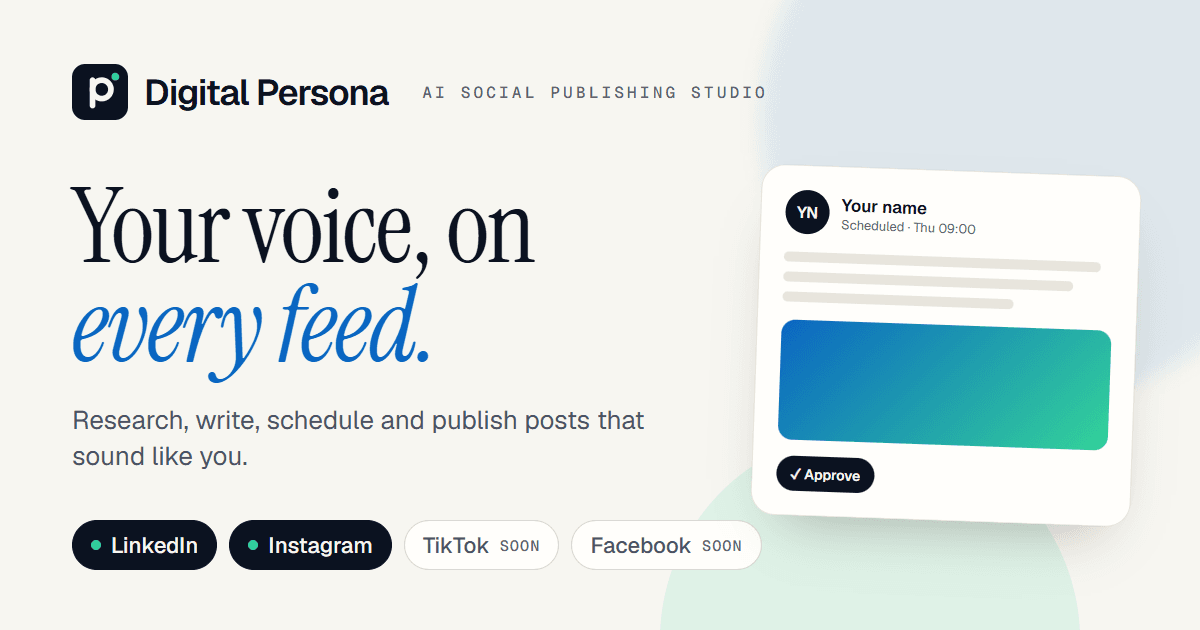
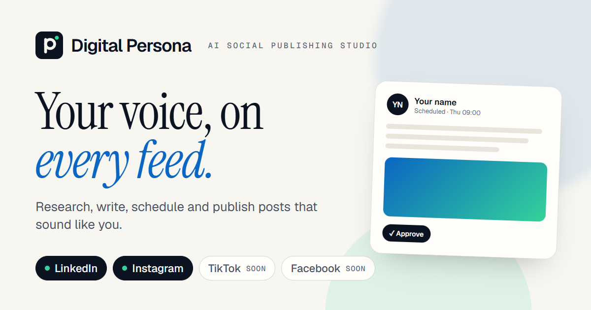
Social card
1200 × 630. Shown when a Digital Persona link is shared.
Name & voice
Two words, both capitalised.
Write Digital Persona, not DigitalPersona, Digital persona or DIGITAL PERSONA. Where space is tight, use Persona. When space allows, pair the name with the tagline.
Tagline
AI social publishing studio
Short description
Research, write, schedule and publish social posts in your own voice. Live for LinkedIn, Instagram and Facebook today, with TikTok coming soon.
Boilerplate
Digital Persona is an AI publishing studio for professionals. It learns the topics you want to be known for and the way you write, researches what is timely, and drafts posts, polls, article shares and quizzes you can edit, schedule or approve in one click. Digital Persona publishes to LinkedIn, Instagram and Facebook Pages today; TikTok is on the way.
Clear over clever
Say what it does. Plain words, short sentences.
The user is the author
Digital Persona helps; the voice and the decision are theirs.
Specific, not hyped
“Drafts three posts for your week”, not “10x your reach”.
Calm confidence
No exclamation marks, no emoji in product copy.
Usage
Keep the mark as it is.
Use the files on this page without changes. Place the mark on plain backgrounds with enough contrast.
Do
- Use the reversed mark on dark or photographic grounds.
- Keep the clear space and minimum sizes.
- Refer to platforms by their own names: “Digital Persona for LinkedIn”.
- Link to the product when you mention it online.
Don't stretch or squash it
Don't recolour the tile
Don't rotate it
Don't drop the presence light
Platform names
Digital Persona publishes to LinkedIn, Instagram, Facebook today, with TikTok coming soon. Those names and logos belong to their owners. Don't combine them with the Digital Persona mark or suggest an endorsement.